Airport City Gdańsk
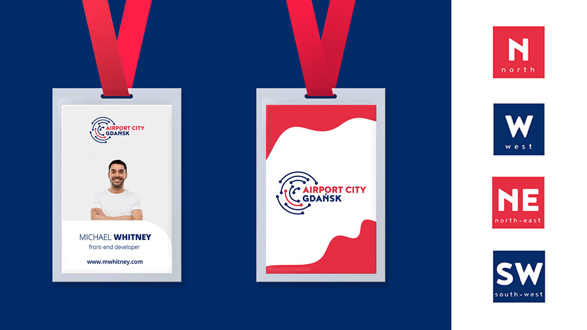
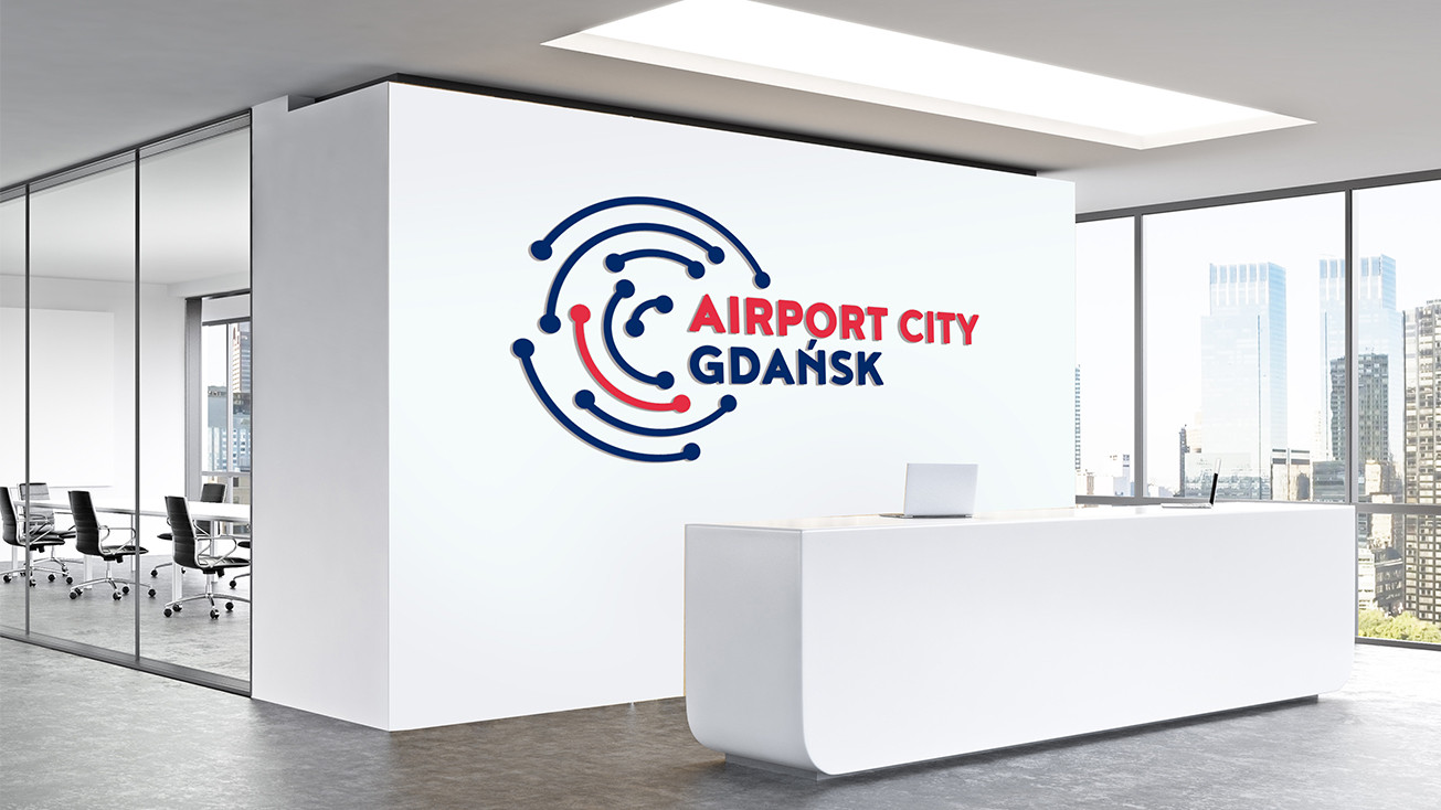
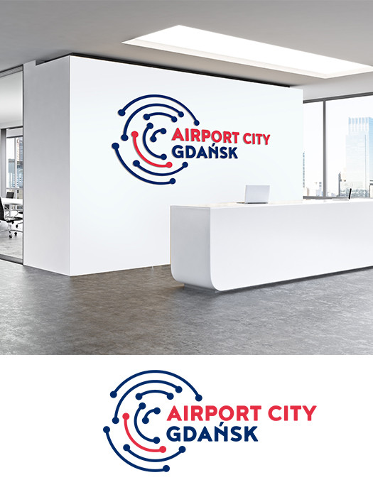
Working on the ACG Buisness Park Gdańsk Visual Identity Project our goal was to visually show the multifacetedness of communication. At the same time, the client wanted to emphasize the uniqueness of the city of Gdansk, where the centre is located. That's why we decided on a navy colour scheme that refers to him. The logotype that is the base of identification are points connected by lines that symbolize destinations, or people who are heading for the next destination on our planet. Connections can be air, people-to-people or business-to-business. All lines are arranged in a circle symbolizing the globe, but also international connections, in the centre of which Gdańsk is located.


COMMUNICATION
connections, energy, comfort, bonds, buisness, Tricity, travelling


