Day/Night Beer
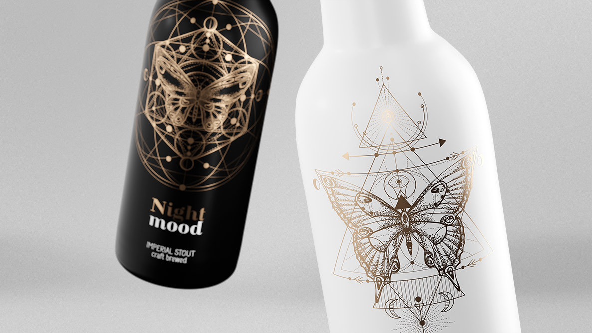
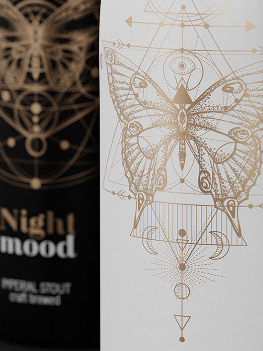
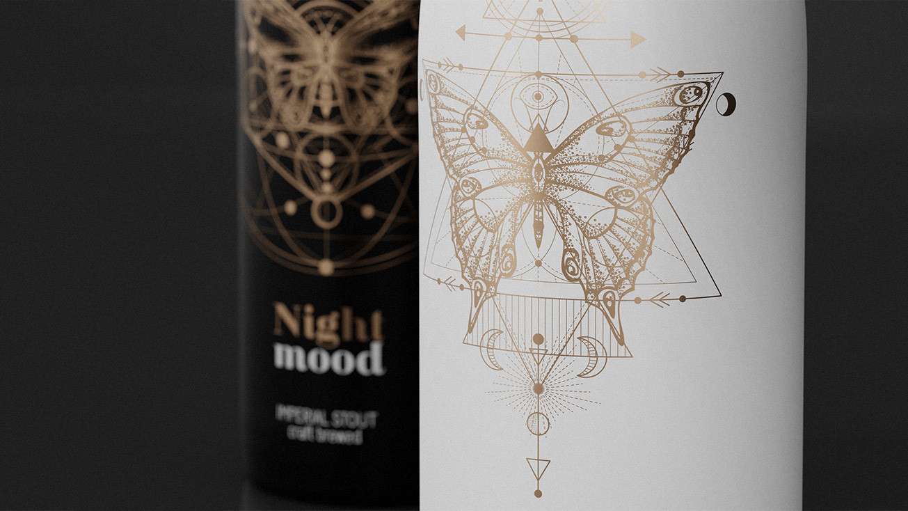
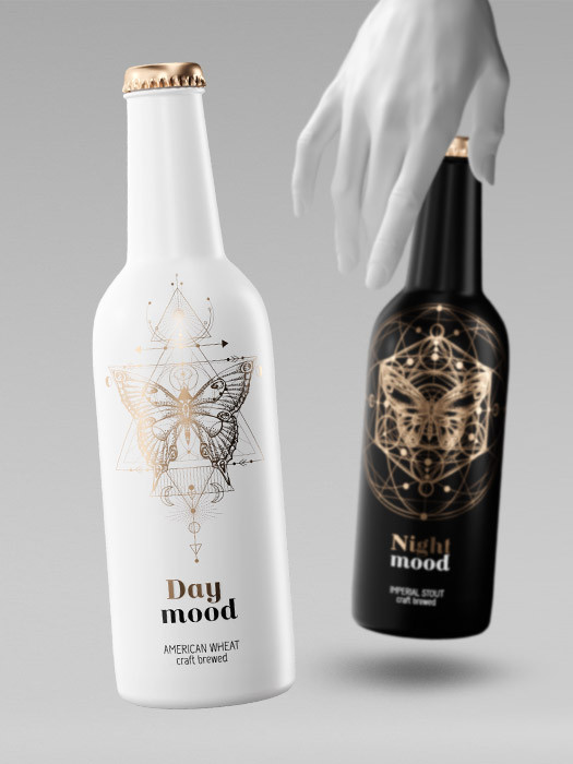
An out-of-the-box project aiming to change the perception of a beer product as an ordinary one. In this design we combined quality with elegance. Golden typography and linear graphics perfectly contrasts with the pure matte black and white background. This contrast is not accidental - it results from the "Day mood" name used for the light bottle and "Night mood" for the dark one. For this reason, also, a butterfly and moth image has been placed on the front as its nocturnal counterpart. The extreme dissimilarity of the two products not only attracts attention but also makes it easier to distinguish them on the shelf.
CLIENT:
BRO BREWERY
PROJECT:
women's day/night beer
Objective:
new version of a well-known product, premium quality
UNUSUAL
day-night, mystery, feminine, premium, new quality
05.
{{ currentHomeProduct|twoDigitNumber }}.
scroll down 

swipe down


