Naturally
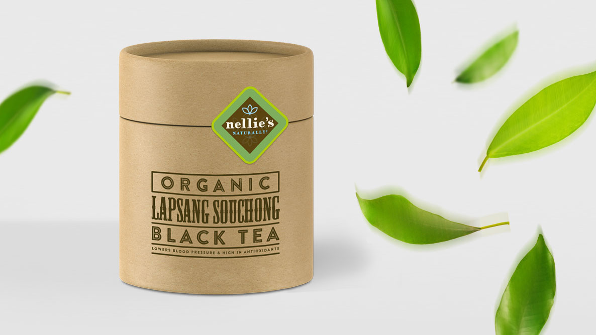
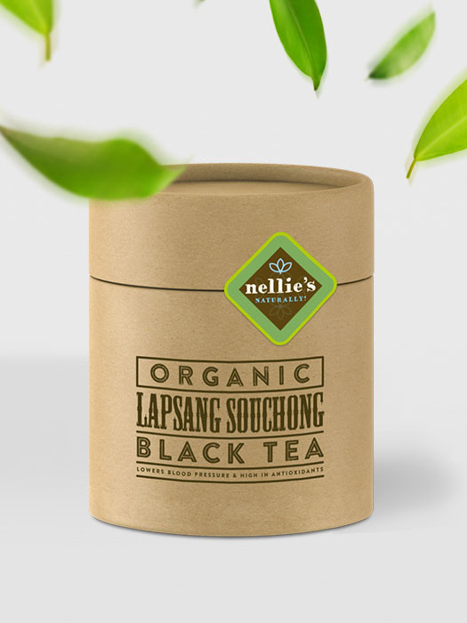
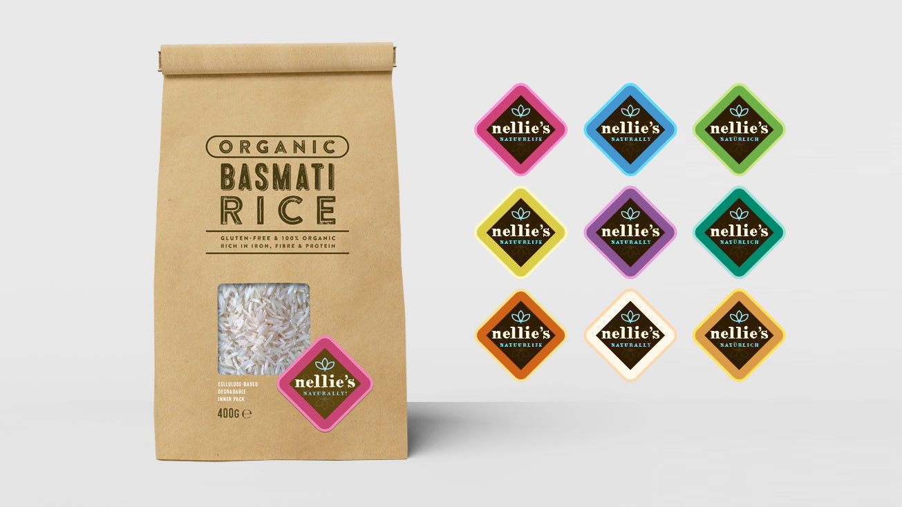
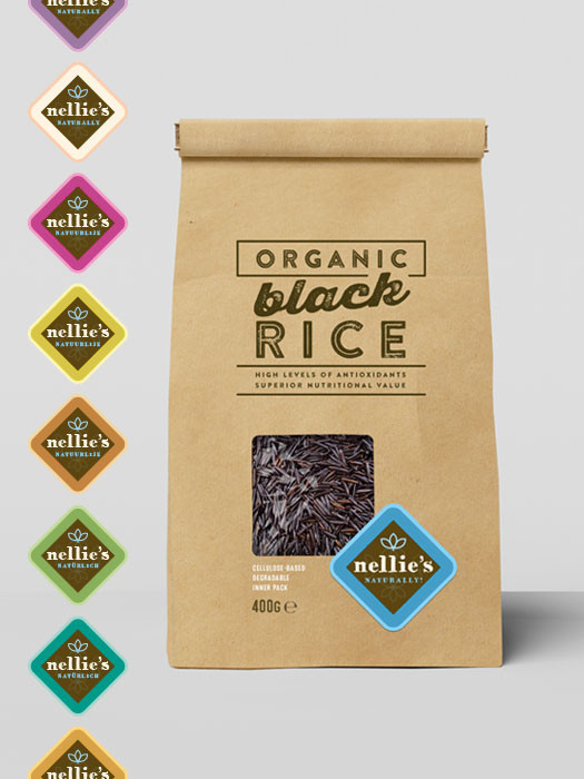
This line of biological rice and tea was originally planned by the client as a line of maximally nine products, within their current brand of oriental spices and sauces. However, by keeping the design in line with their existing brand style and logo, it would be impossible to give the new products the look and feel they were needing. We proposed name and concept for a sub-brand, with five rice products and two kinds of tea. It had to be ecological, with even the packaging window made from degradable cellulose. We took inspiration from burlap rice sacks, with their grunge, corroded printings; in the rice packaging you can almost see these rough, open sacks being filled, somewhere far away in an oriental country.

NATURALLY
biological, natural, kraft paper, environment, caring, simplicity, minimalism, earth, typography


